Garden Variety
Cannabis for Canadians
CMO, Native RootsGarden Variety · 2019–2020
Launched, 2019 · acquired
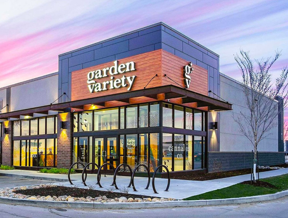
Building a new brand and retail experience for Canada.
As CMO at Native Roots, I led Garden Variety’s Manitoba expansion across brand strategy, identity, retail design, packaging, apparel, content, and the launch campaign. The assignment was to create a distinct brand and carry it through the full customer experience.
I set the creative direction and led the in-house studio and external collaborators from the initial brief through production. We opened three stores with a First Nation as co-owner; the business was later acquired by Delta 9.
An identity with room to grow.
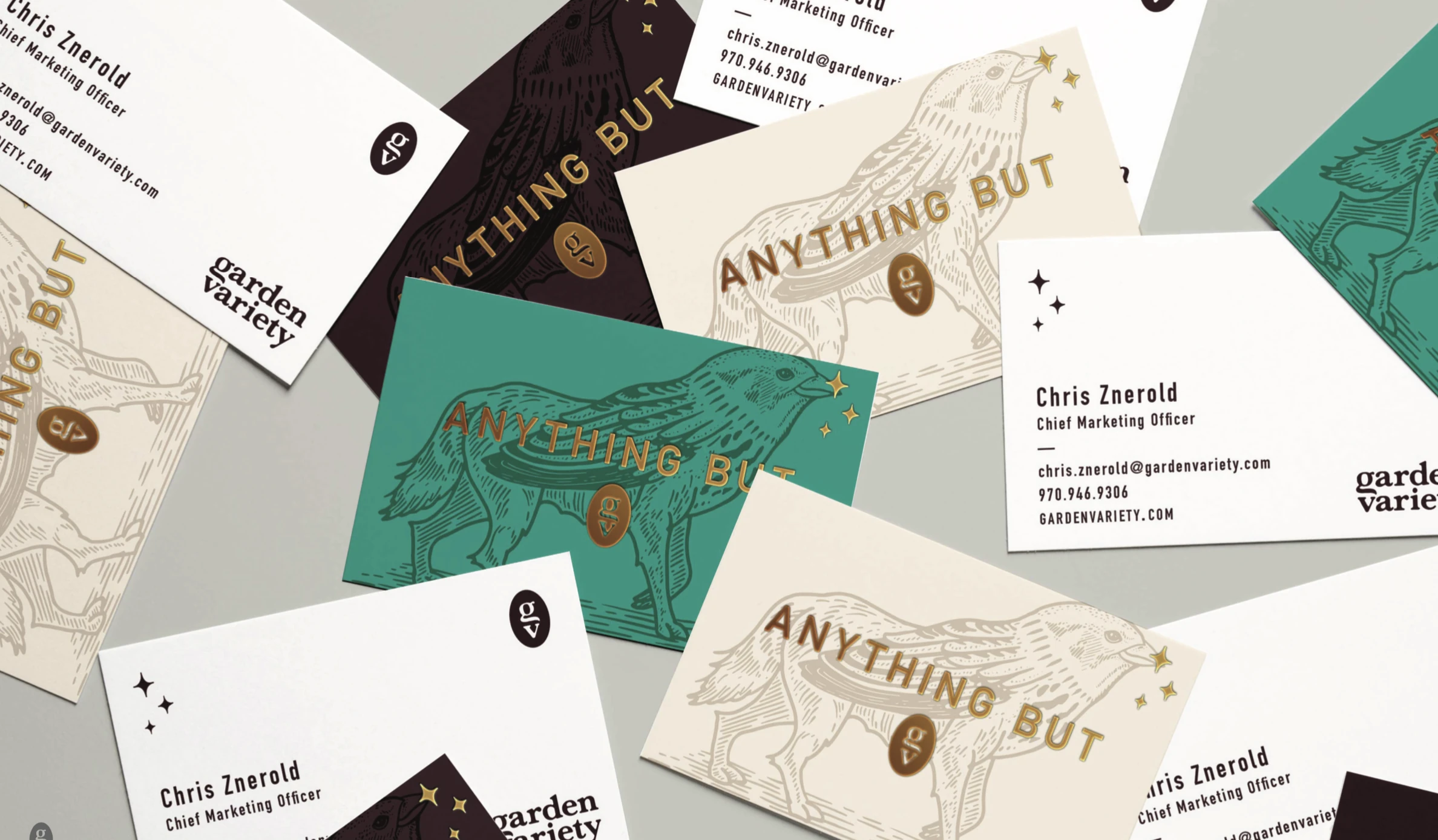
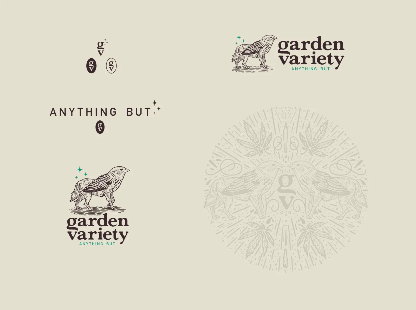
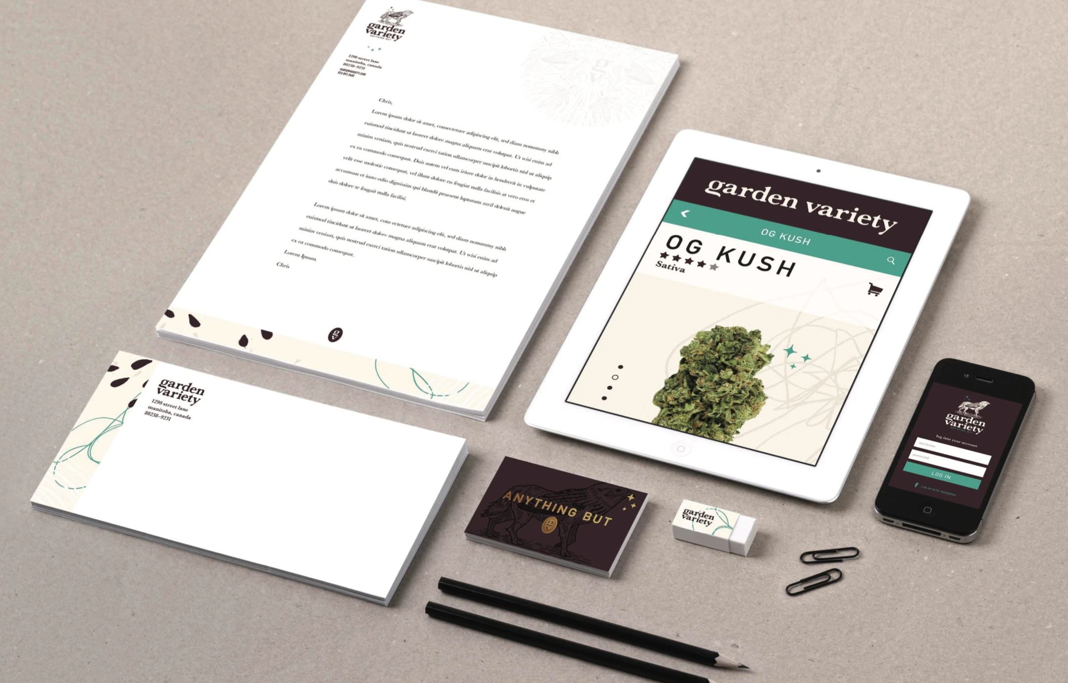
I set the brief and creative direction, then led the in-house studio and external designers in developing the identity. The Sparwolf—a sparrow-and-wolf hybrid—gave the brand its own character. The wordmark, botanical illustrations, patterns, and conversational language formed a system the team could use across formats.

A café that happens to sell cannabis.
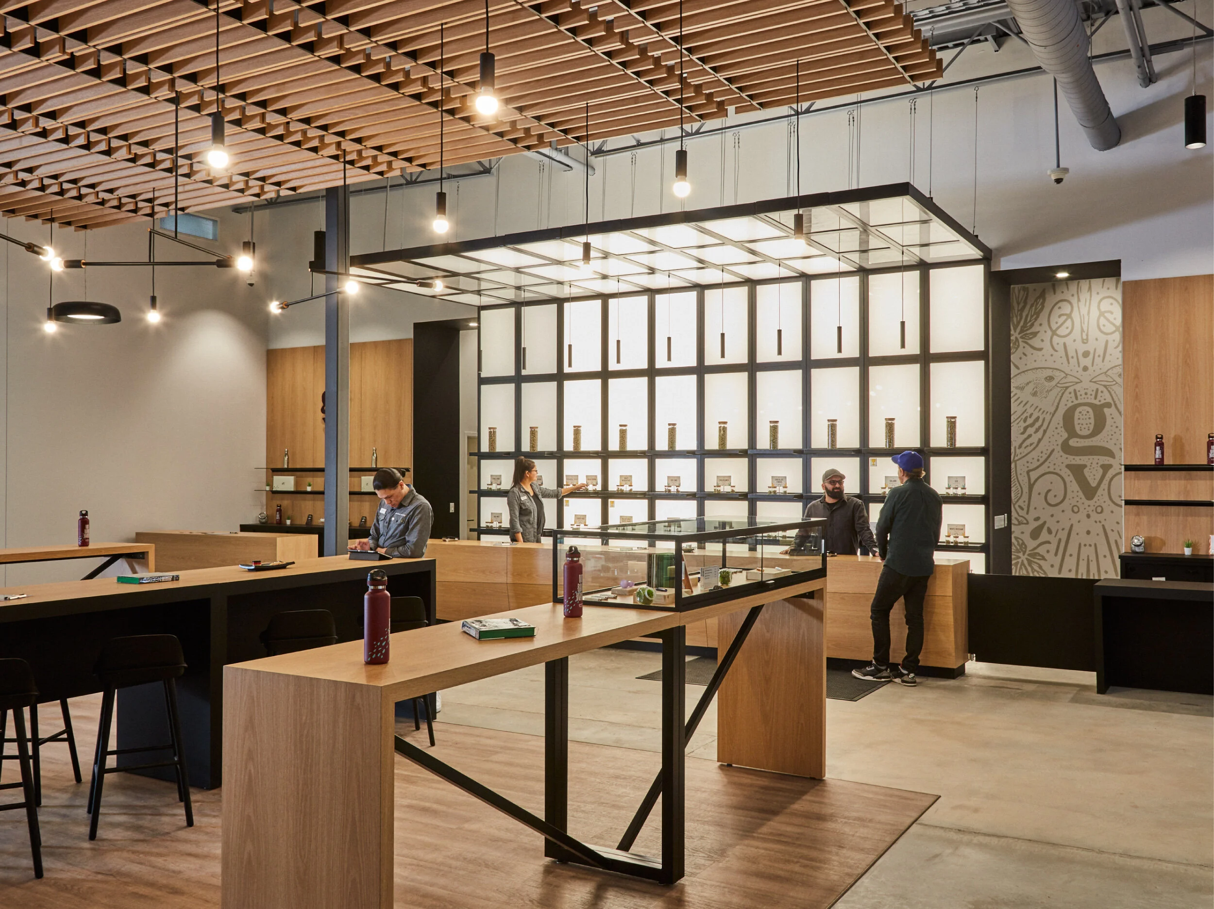
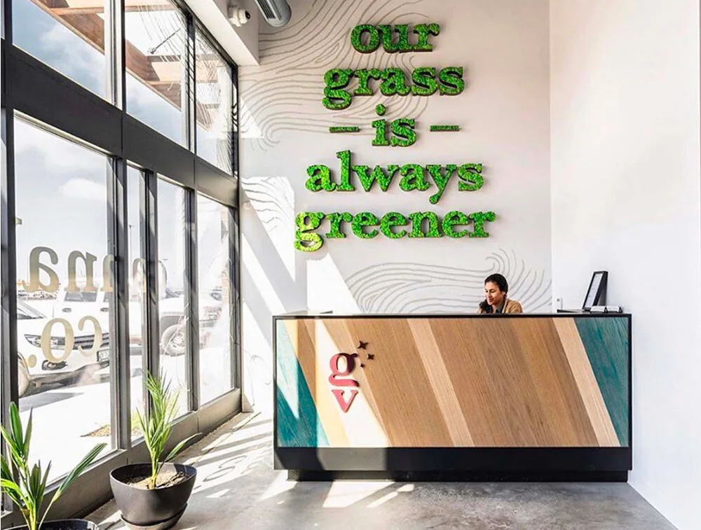
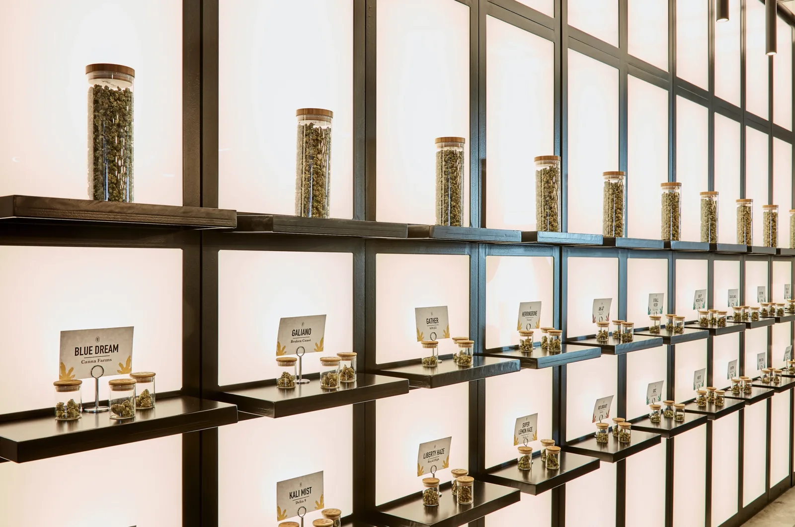
That positioning shaped the store experience. A central flower bar, open shelves, warm materials, and approachable displays made space for browsing and questions. I led retail creative direction as part of the three-store launch, carrying the brand from the front door to the counter.
The system reached every part of the purchase.
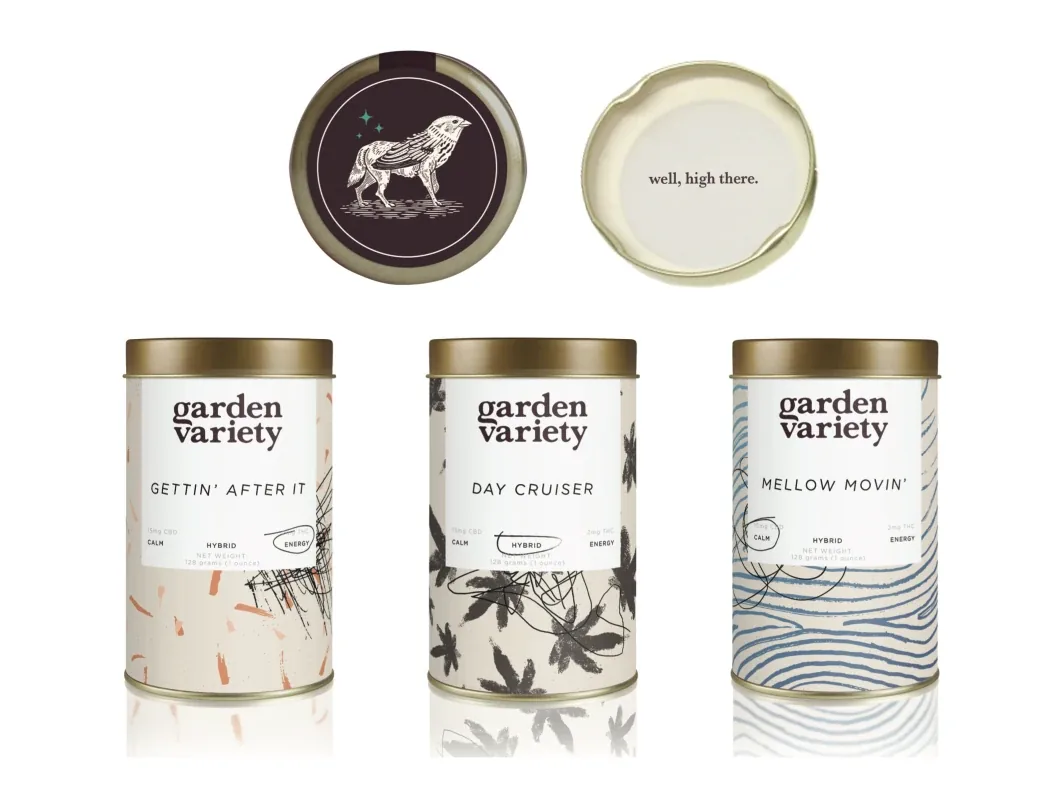
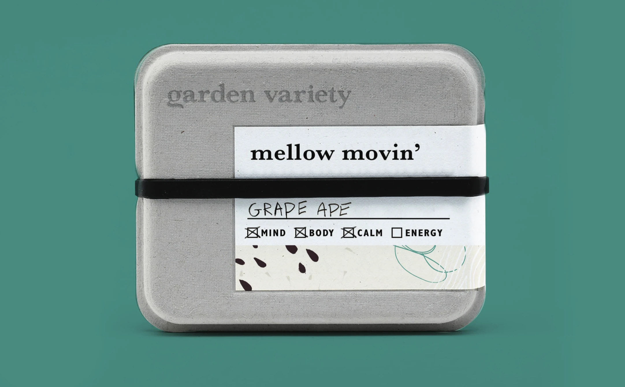
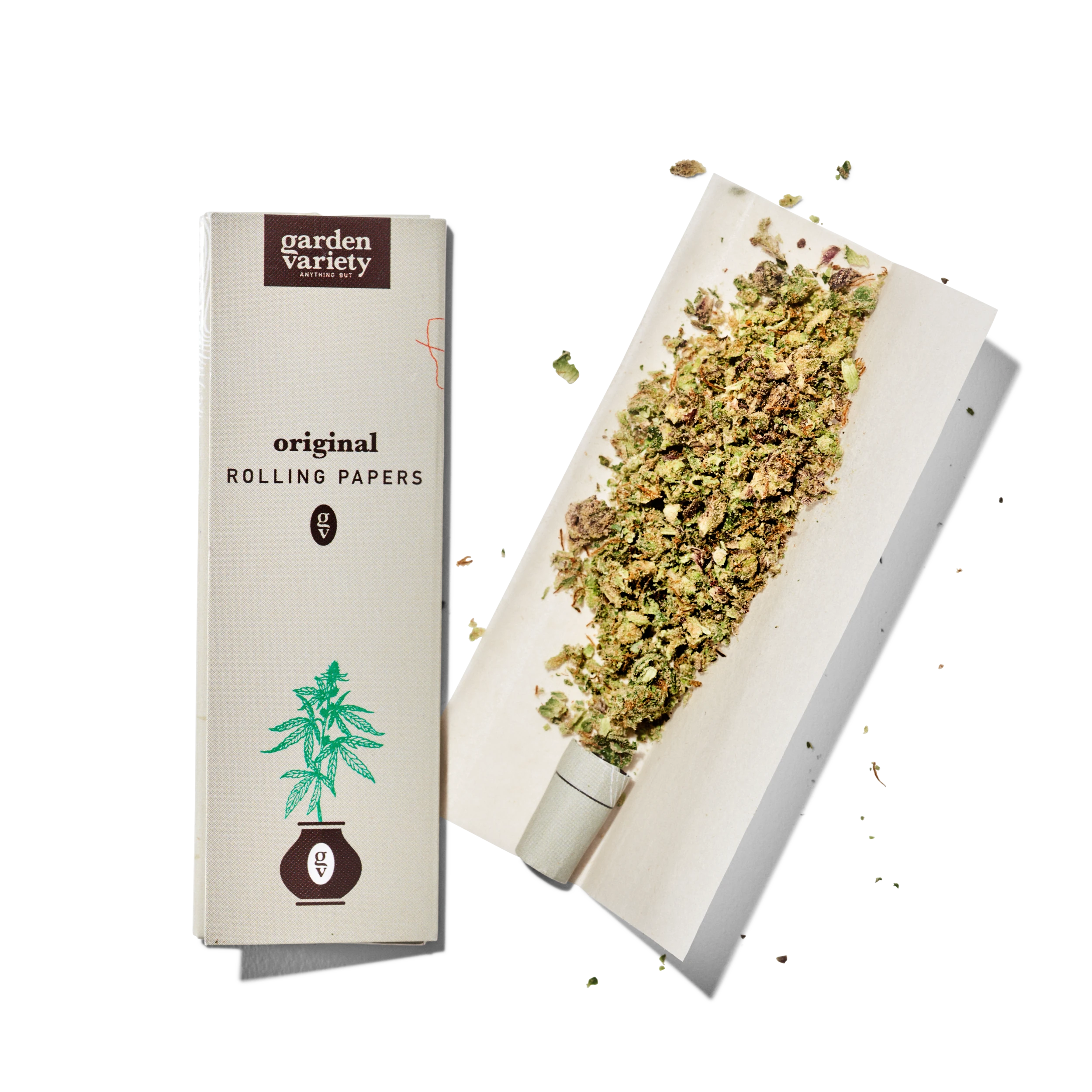
Packaging, product information, shopping materials, and digital applications needed to feel like the same brand. The studio developed that work together, from the tone of a product name to the details on a label. The packaging concepts below show how the botanical system could distinguish products while keeping the family recognizable.
A merchandise collection with its own voice.
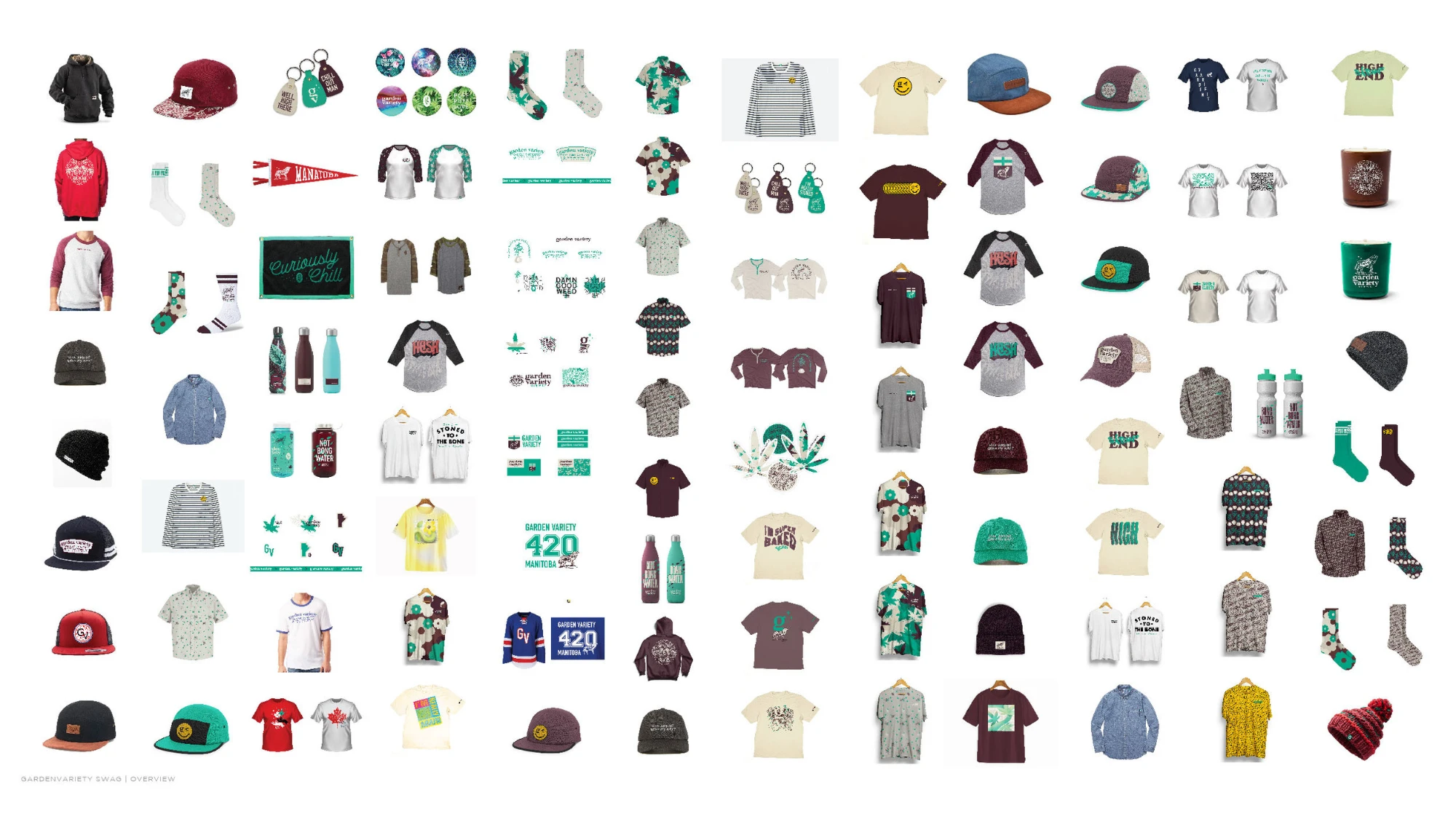
I directed apparel and accessories as an extension of the brand’s personality. The collection combined different marks, illustrations, and lines such as “Our grass is always greener.” The studio developed a broad merchandise program alongside the pieces produced for the stores.

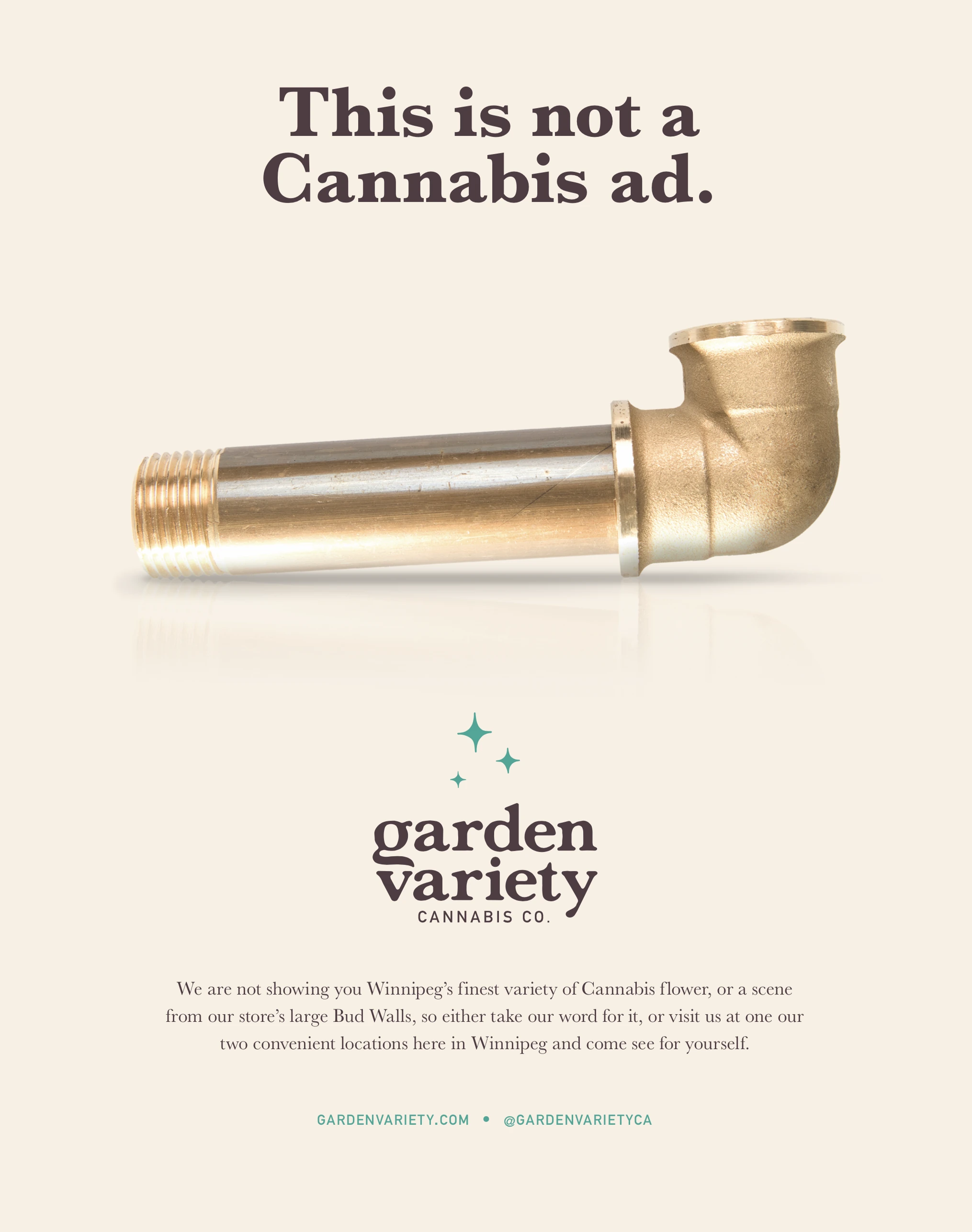
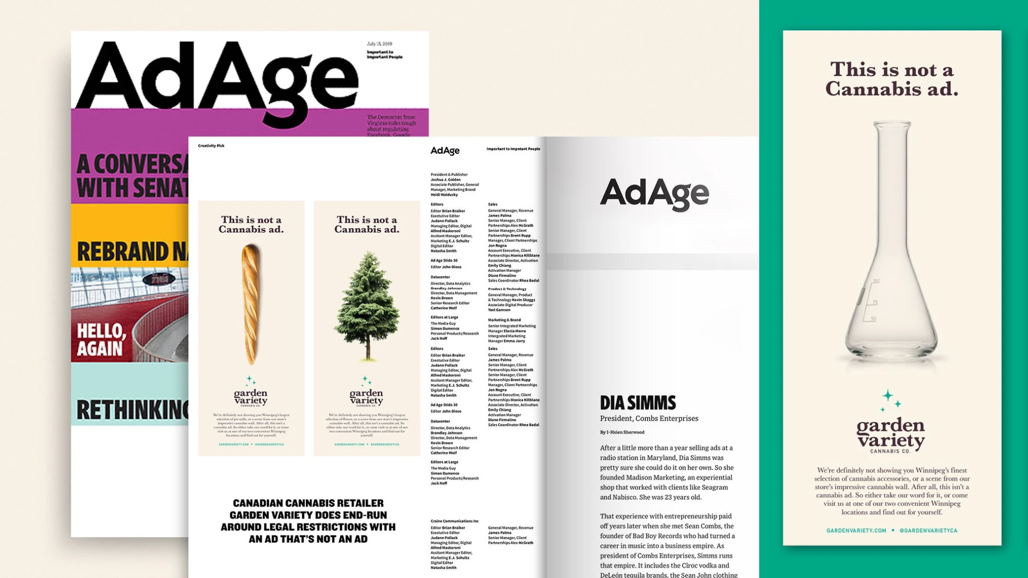
“This is not a cannabis ad.”
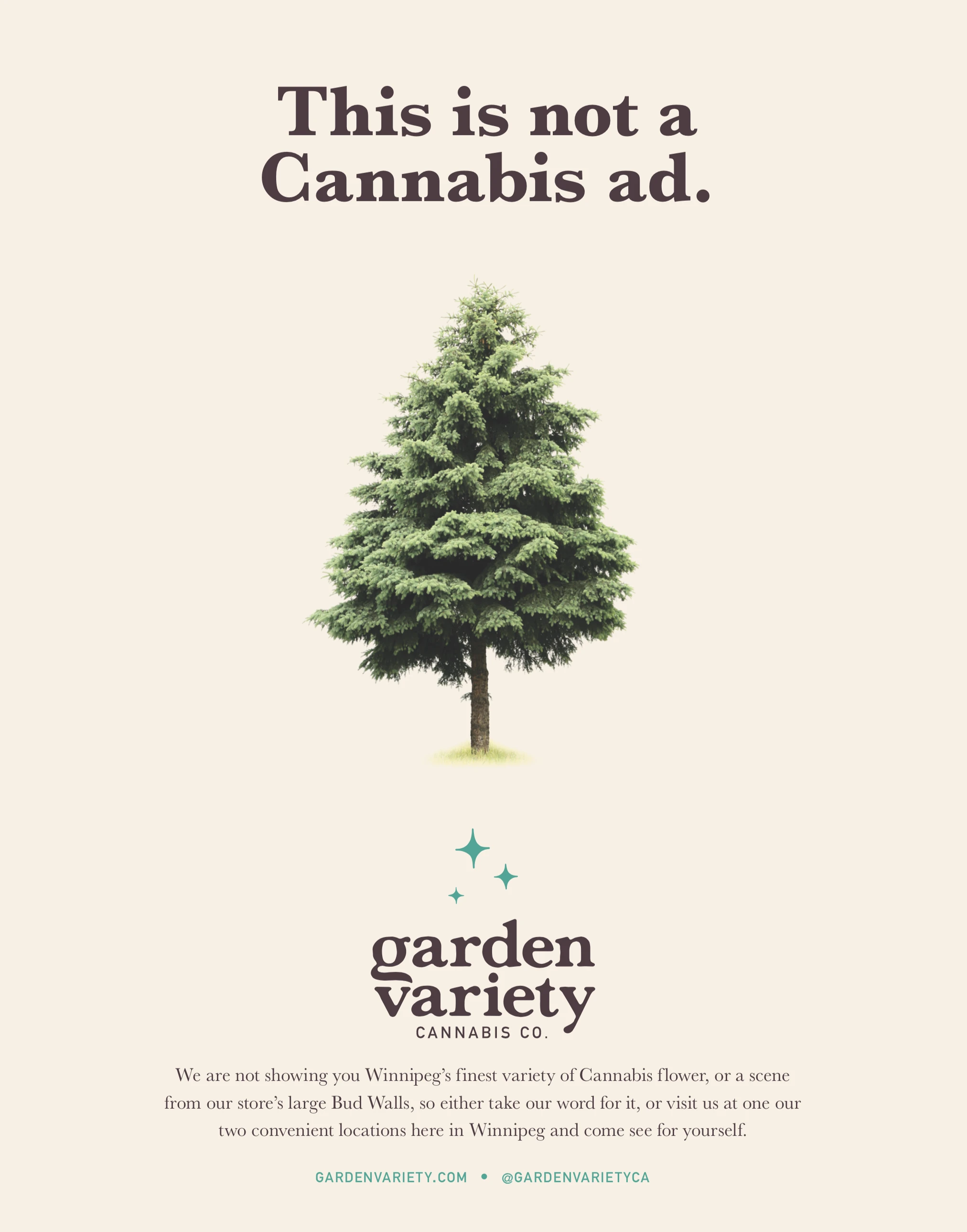
Restrictions on promotion were part of the launch brief. The print campaign turned that constraint into the idea, pairing familiar objects with the line “This is not a cannabis ad.” I led the campaign as part of the broader brand launch; it was featured as an Advertising Age Creativity Pick in July 2019.
A voice that could sustain more than a launch.
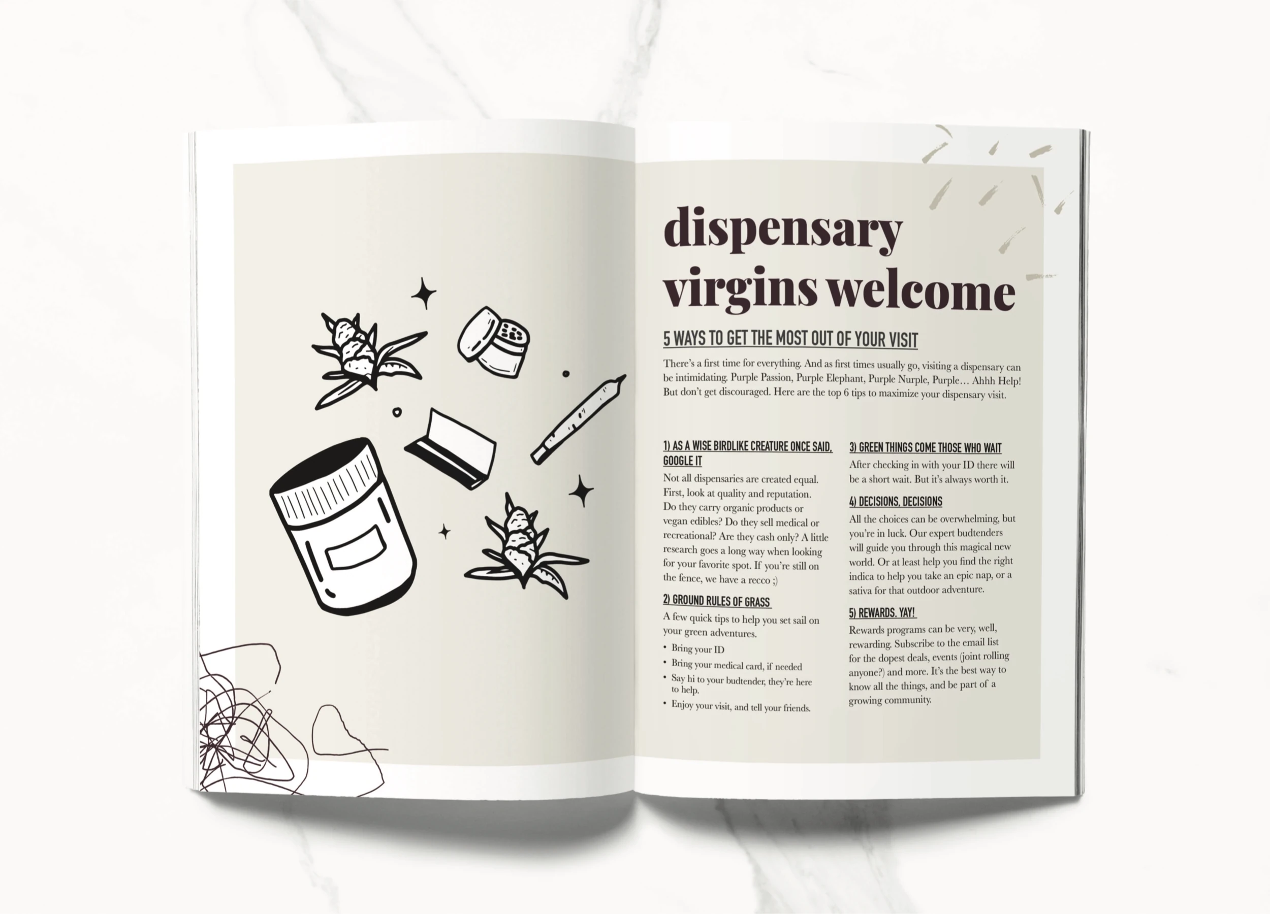
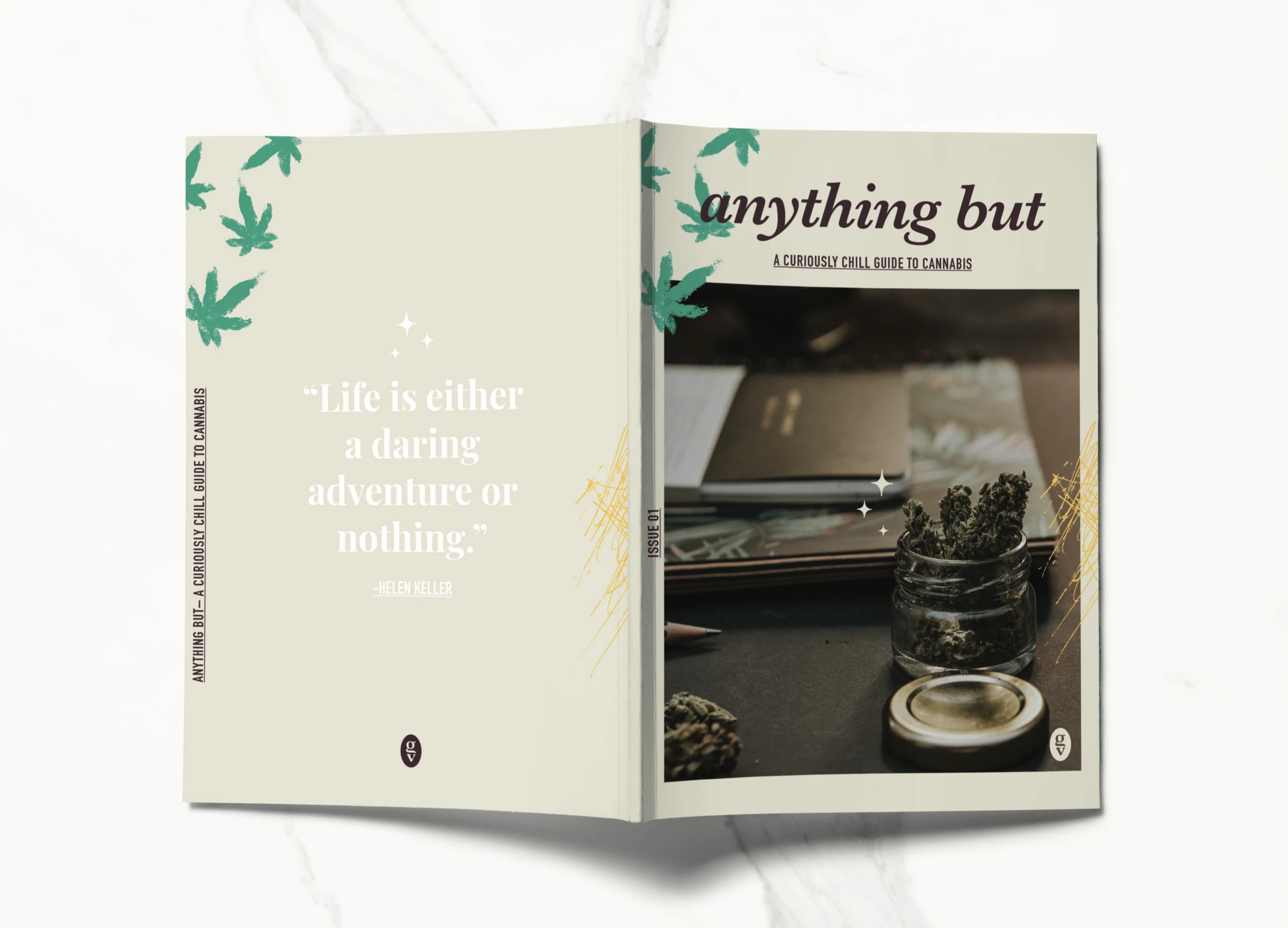
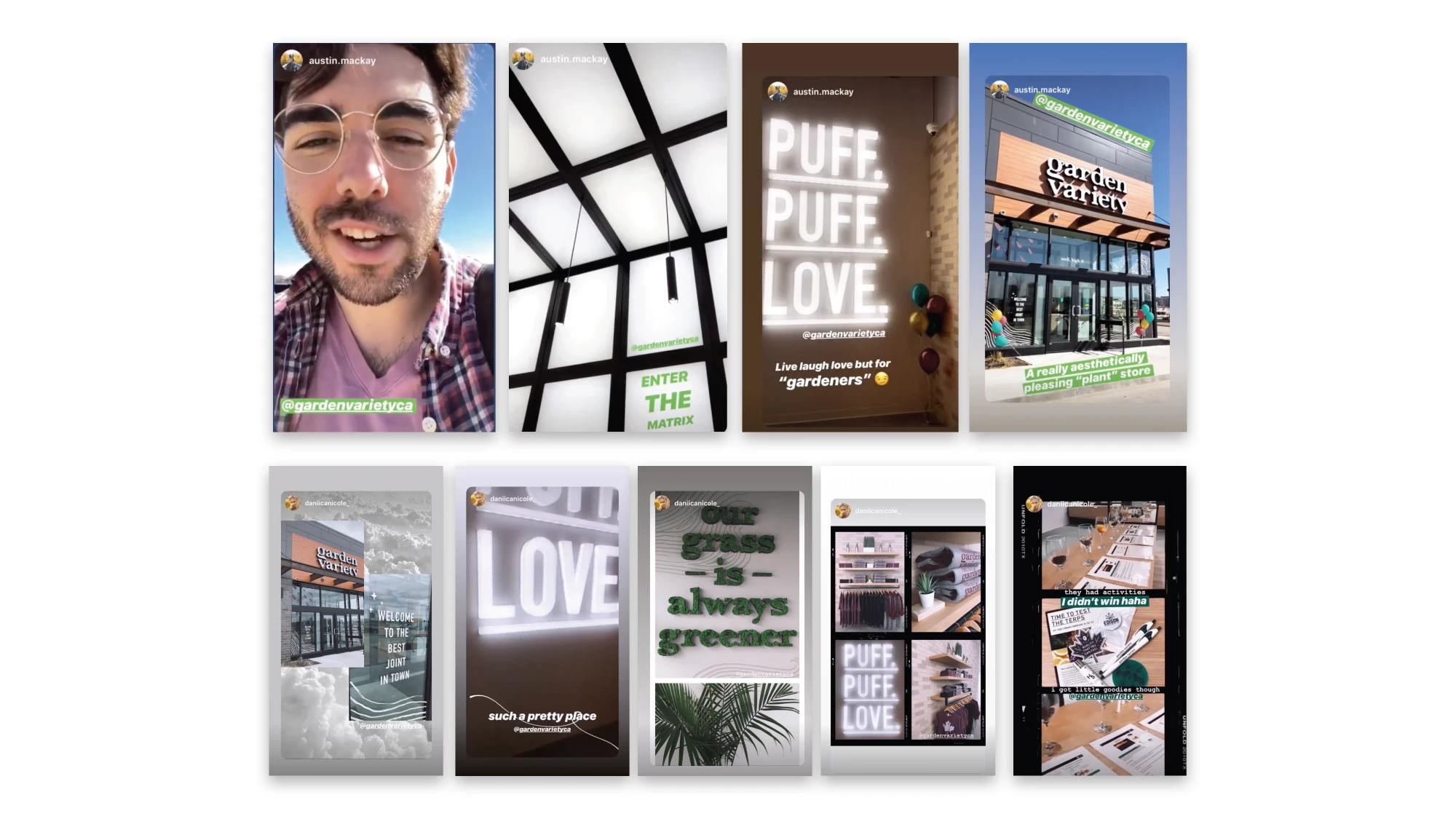
The content system extended the brand into editorial layouts, educational themes, and community programming concepts. These designs show how the voice and visual language could support an ongoing calendar. Opening-week social coverage provides a separate view of the brand as people encountered the stores.


Exploring the brand beyond the store.
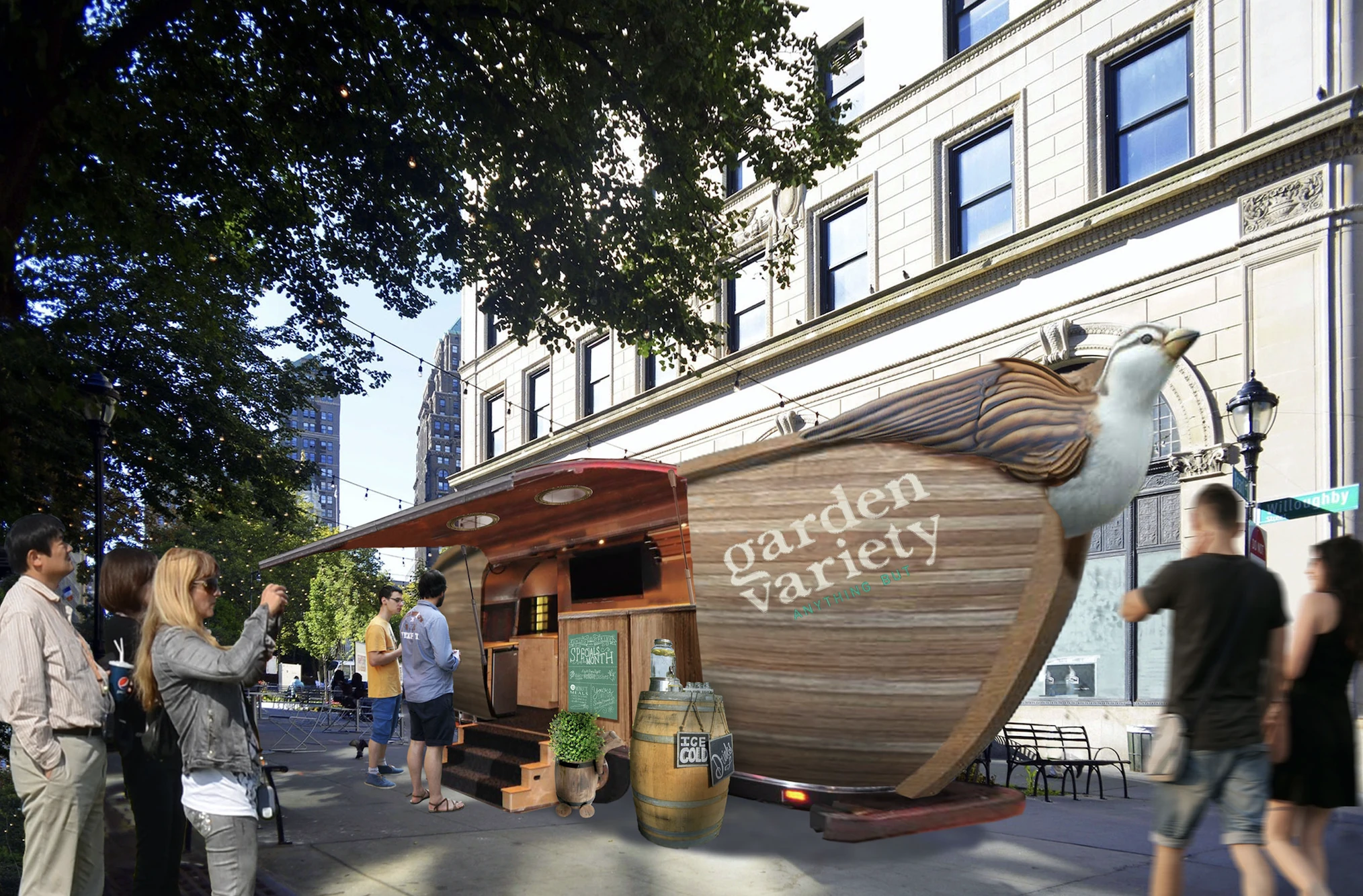
The archive also includes an experiential concept for a mobile Garden Variety space. It was not built, but it shows how the team explored translating the brand’s character into a different kind of physical experience.
From brand direction to opening the doors.
I led the work through the Native Roots studio, collaborating with external designers and photographer Justin Walker. I directed the creative work and production approvals with the Native Roots executive team, keeping the identity, retail, merchandise, content, and campaign connected.
We launched three stores with a First Nation as co-owner. The business was later acquired by Delta 9.