Chris Znerold Product + Brand Systems · AI Design Engineering

The First Pour

Creative director for Marianne’s Harvest, 2025

Strategy:

Nobody plans a meal around the oil. It goes in first and is forgotten by the time the onions hit. Feed Joy makes that first pour the point.

Design:

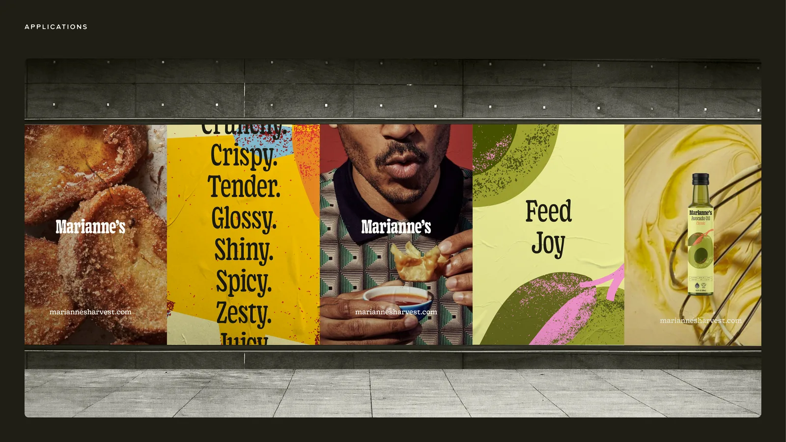
A stack of adjectives rather than a dish. Crunchy, crispy, tender, glossy. The strategy runs in five ‘chapters of joy’, each a reason to trust your palate.

Leadership:

Zero to one through GURU: no packaging and no website before it. I covered concept, brand expression, five labels, the site, out of home, print, social and email.

Product in Hand

The shelf sorts itself.

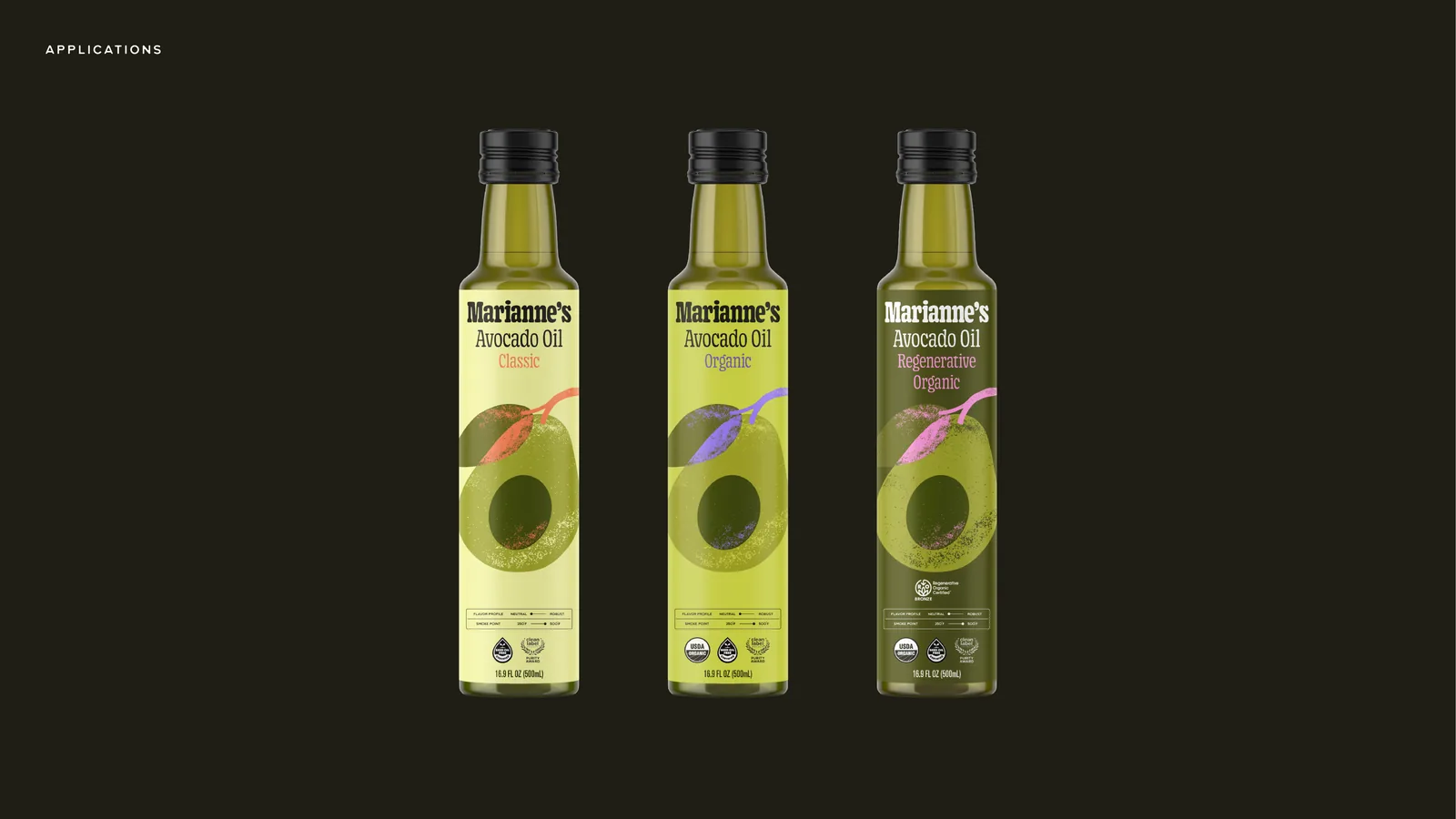
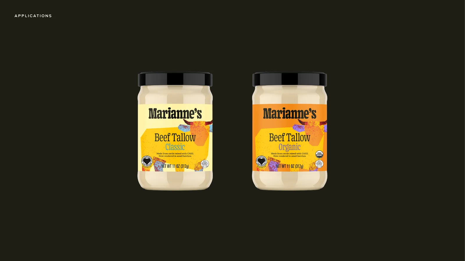
Avocado oil in three tiers, tallow in two, one accent colour per tier. Only the regenerative label carries Feed Joy. The other four still say ‘Ignite the Possibilities’.
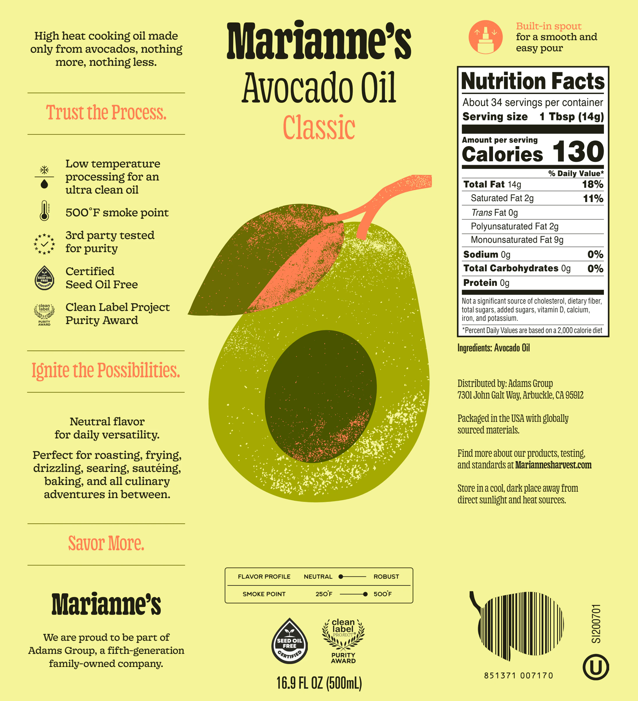
The Avocado Oil Classic label: an avocado illustration with coral accents on the yellow-green label ground, nutrition facts to the right
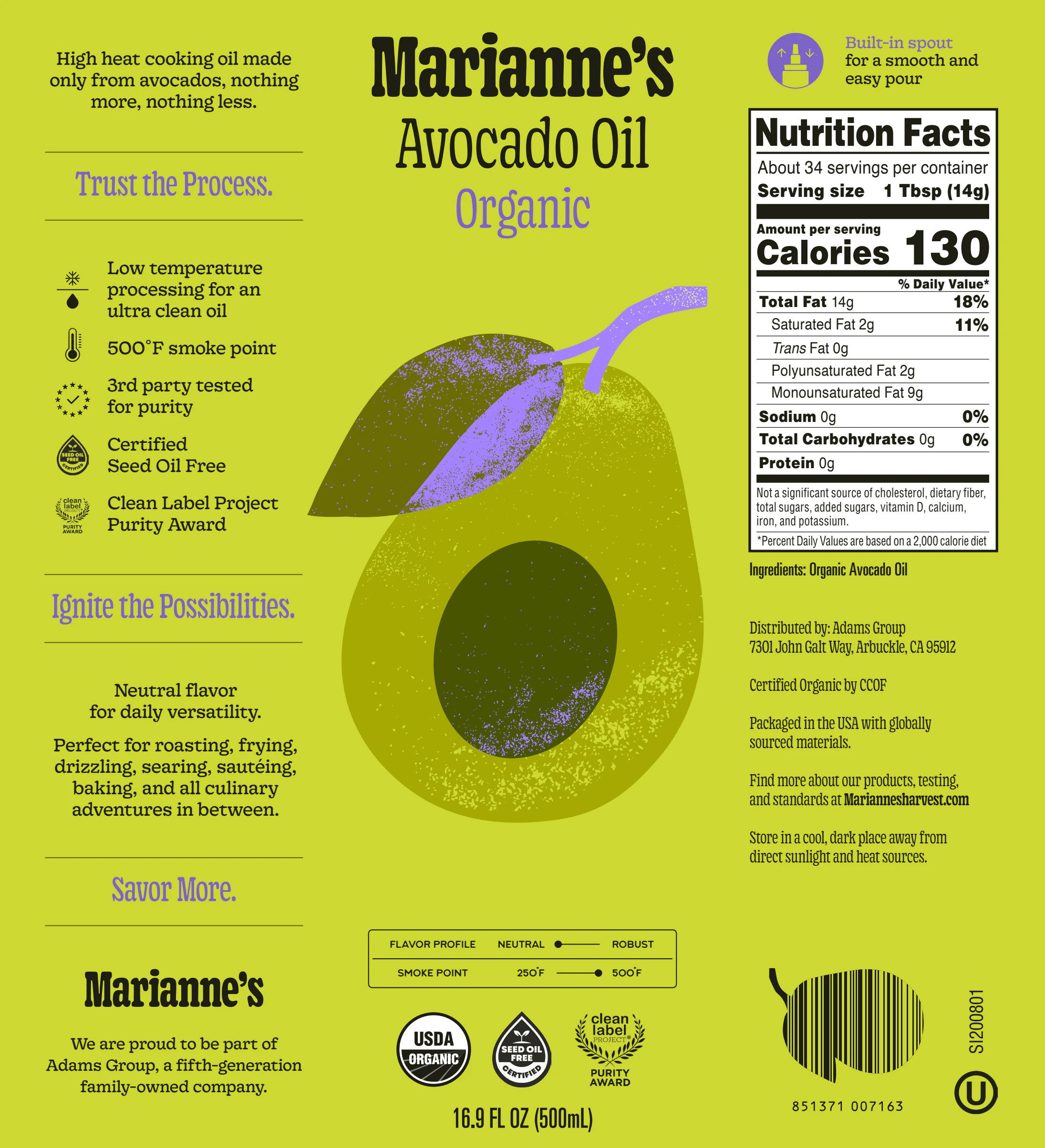
The Avocado Oil Organic label: the same avocado illustration with violet accents
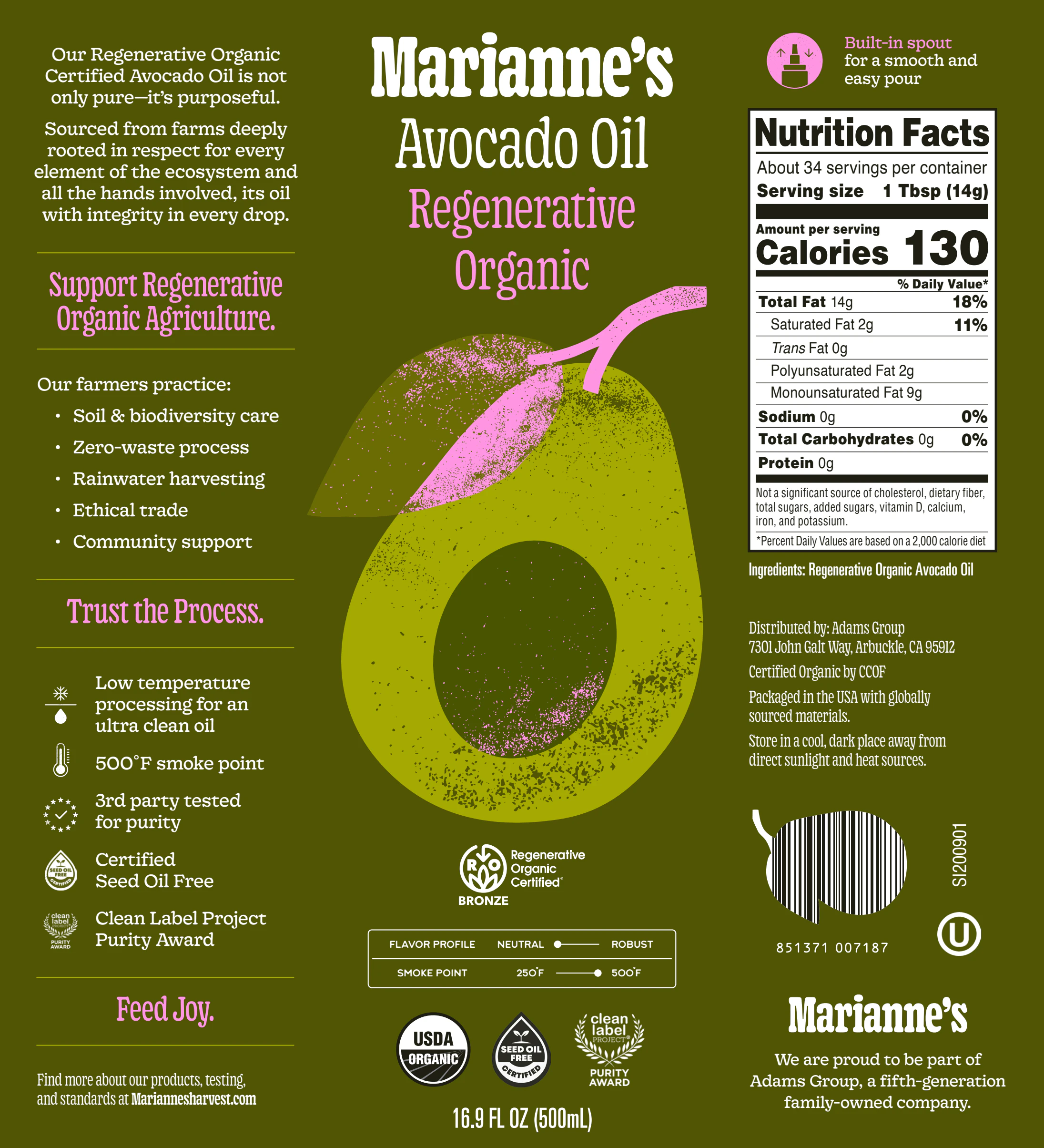
The Avocado Oil Regenerative Organic label on deep olive with pink accents, the only one of the five that carries Feed Joy

Brand system

Joy, in parts.

Feed Joy runs on a short kit: the labels, a slab wordmark over a serif, violet and yellow, an illustration set, and the print that took it out of the kitchen.
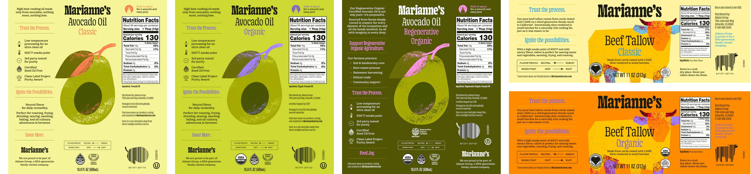
The five labels in a row: Avocado Oil Classic, Organic and Regenerative Organic, Beef Tallow Classic and Organic
Labels, both linesAvocado oil in three, tallow in two.
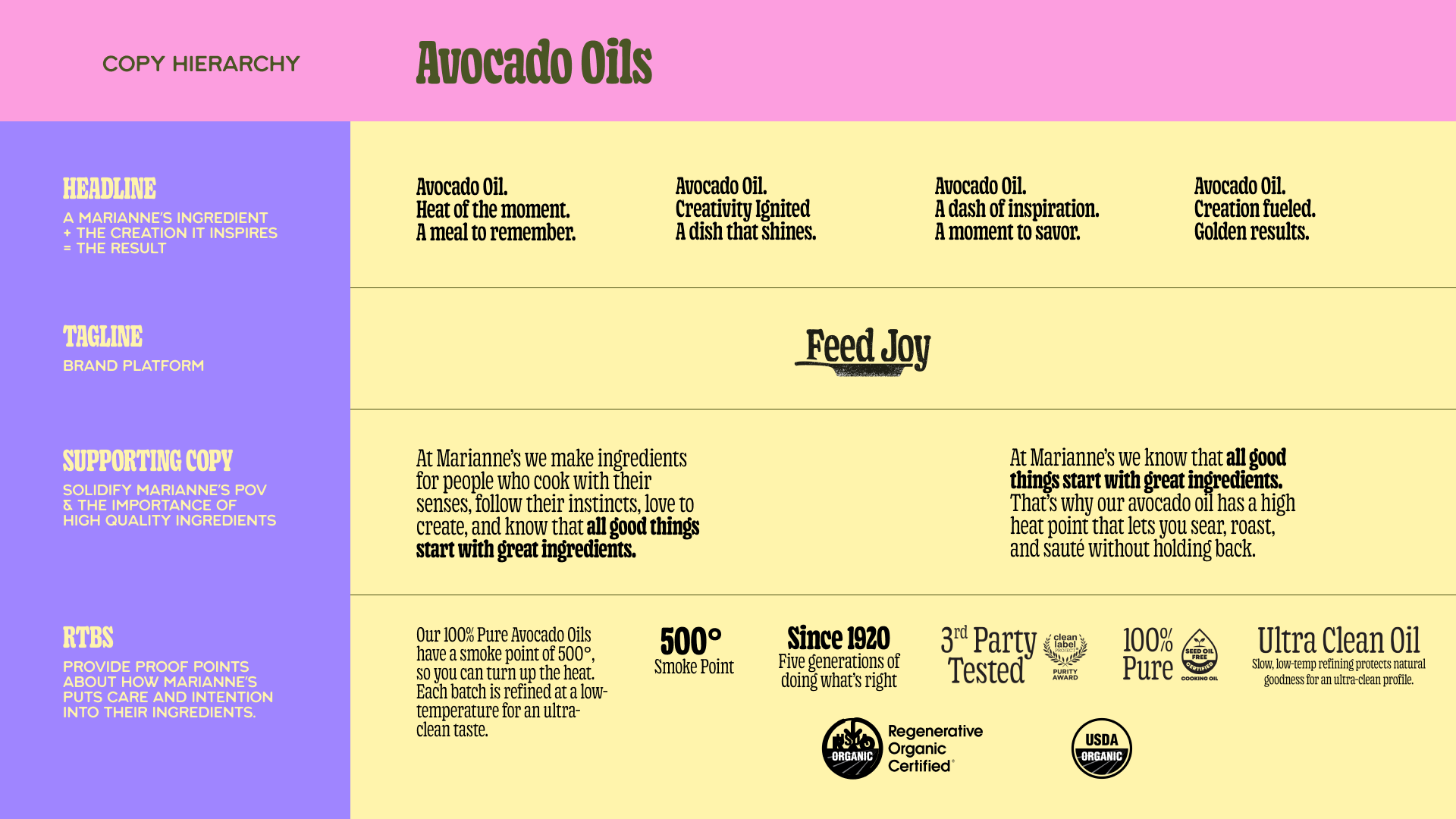
The copy hierarchy page of the brand deck: a headline in slab type over body copy in a serif, with the adjective stack beside it
Type and copySlab over serif, adjectives first.
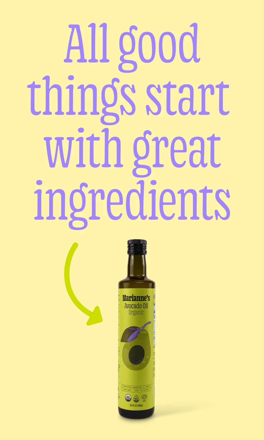
A tall social unit: All good things start with great ingredients in violet slab type on yellow, the avocado oil bottle below
Colour pairViolet on yellow.
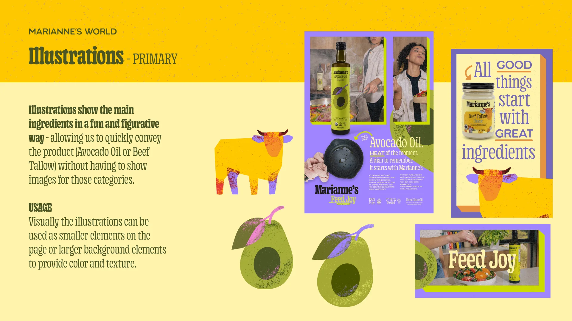
The illustrations page of the brand deck: a cow and an avocado drawn in flat colour beside the bottles
Illustration setA cow, an avocado, flat colour.
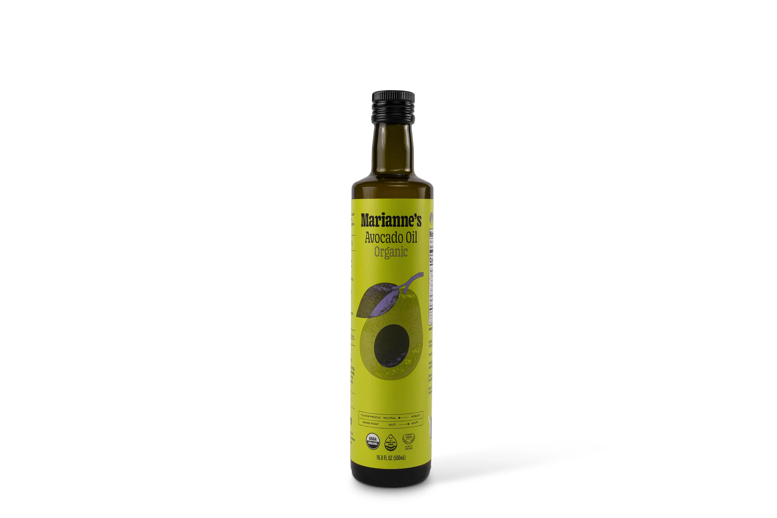
The avocado oil bottle photographed on white
The bottlePackaging, as shot.
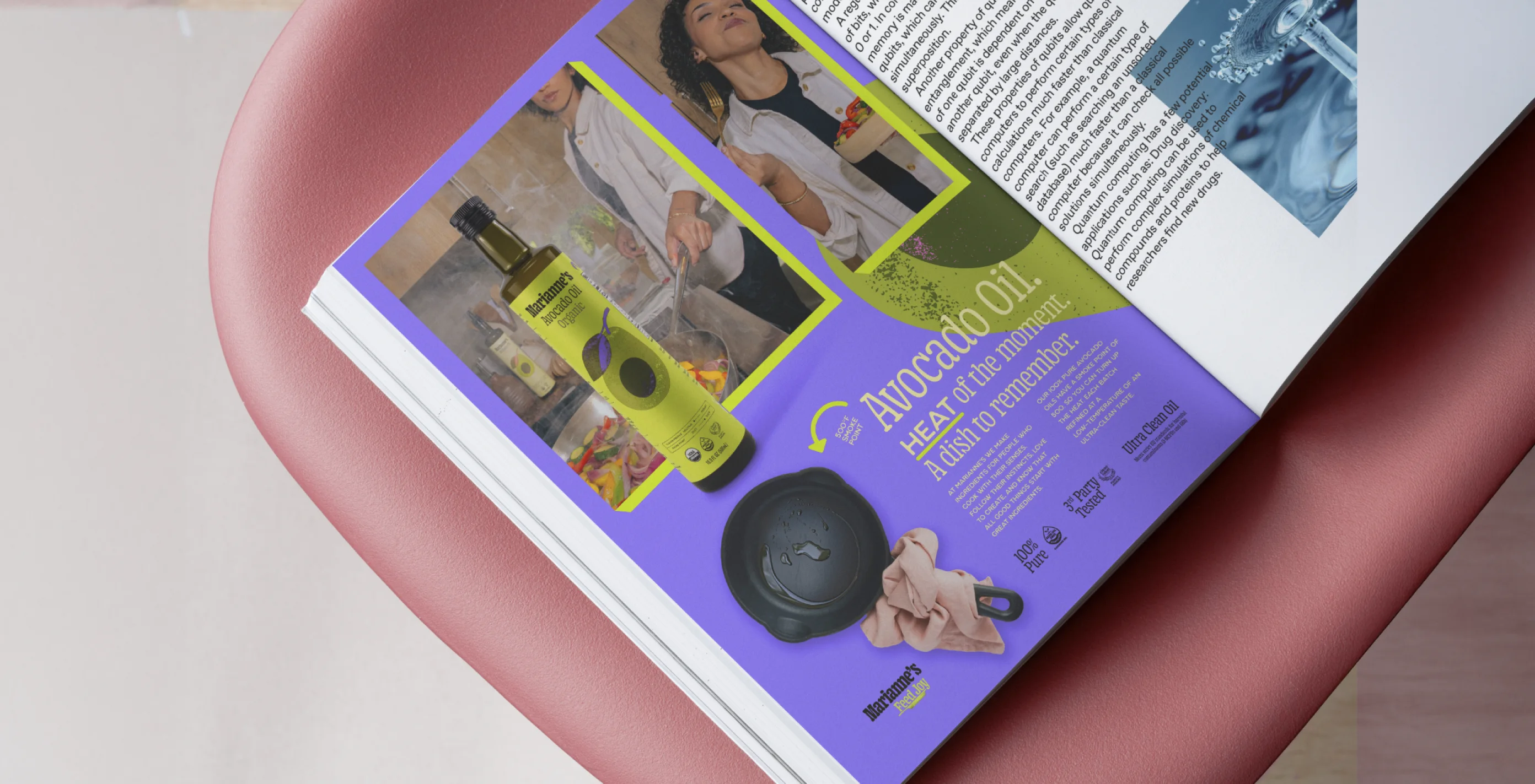
A magazine spread: the Feed Joy campaign across two pages
Print spreadOut of the kitchen.

Product in Life

Feed Joy, literally.

The kitchen shoot gives every unit its people: a sheet pan of vegetables, focaccia on slate, a steak beside the tallow jar, a laugh mid-bite over citrus salad.
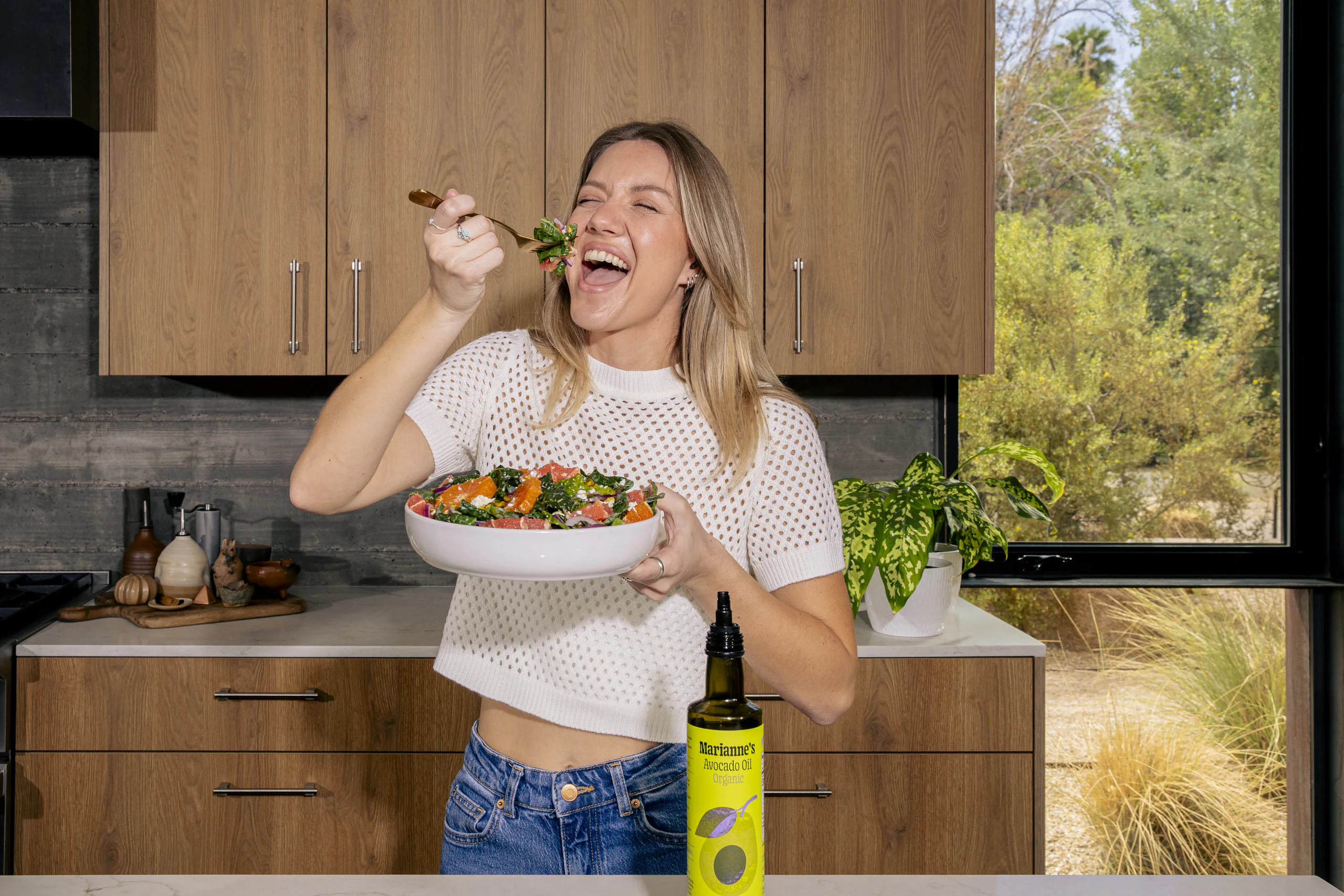
A woman laughs mid-bite over a bowl of citrus salad, the avocado oil bottle in frame beside her

Ecosystem

The site is the pantry.

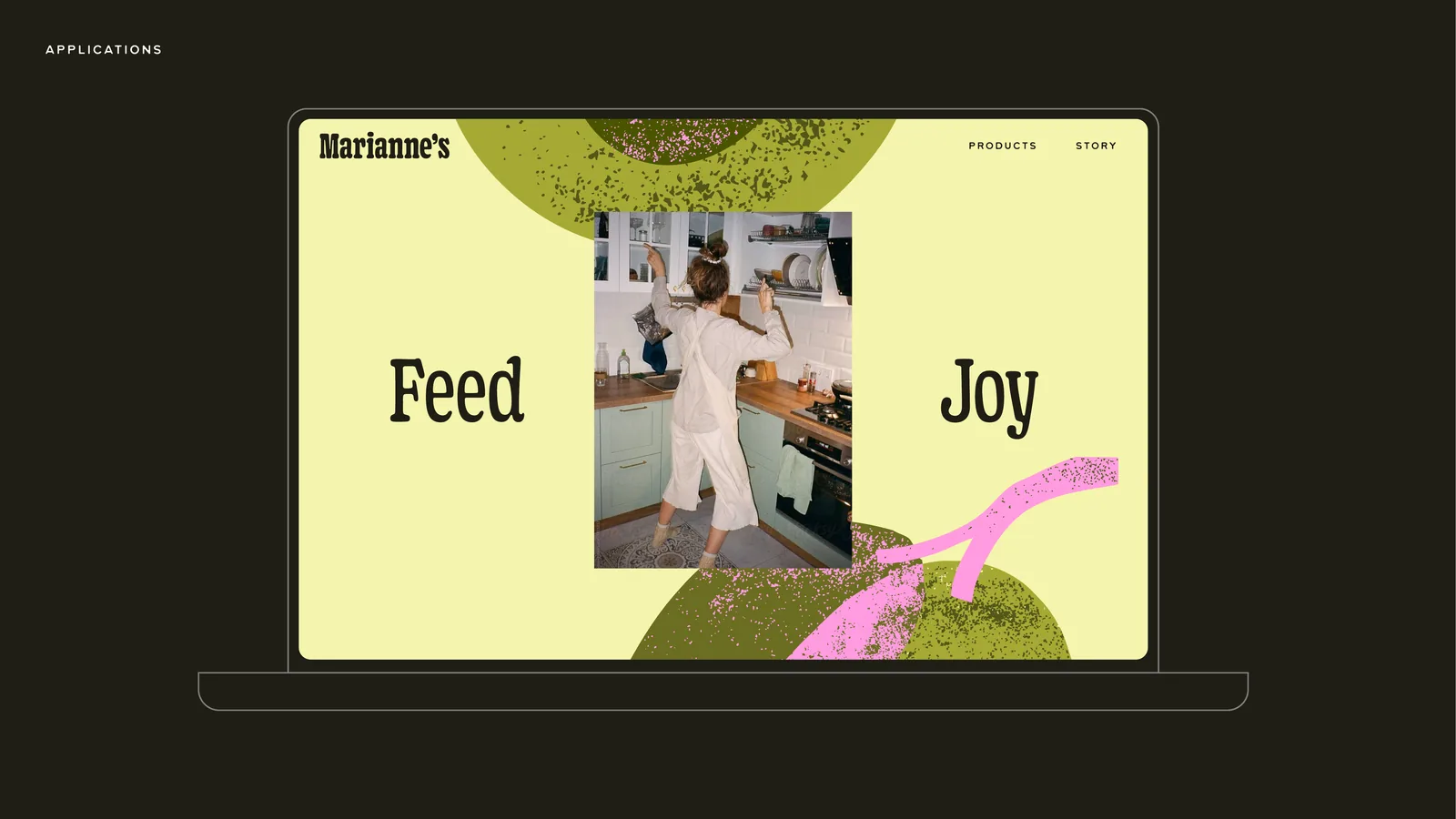
The website sits at the centre, with organic, influencer and paid content around it. The homepage opens on the shoot stills, then Feed Joy in violet slab type, the first ingredient, and the family legacy.

Product in Culture

Out where dinner gets decided.

Cooking oil rarely gets a campaign. It sits low on the shelf and sells on price. The brand book takes Feed Joy out of the kitchen: the shelf, the screen, a subway wall and the feed.
In the wild01/6
Three avocado oil bottles, Classic, Organic and Regenerative Organic, on the brand book’s dark ground
Two beef tallow jars, Classic and Organic, with the yellow labels
The Feed Joy homepage on a laptop: a cook dancing in a kitchen between the two words
A subway wall of wild-posted sheets: churros, the adjective stack, a man with a dumpling, Feed Joy over an avocado, a bottle on a swirl of mayonnaise
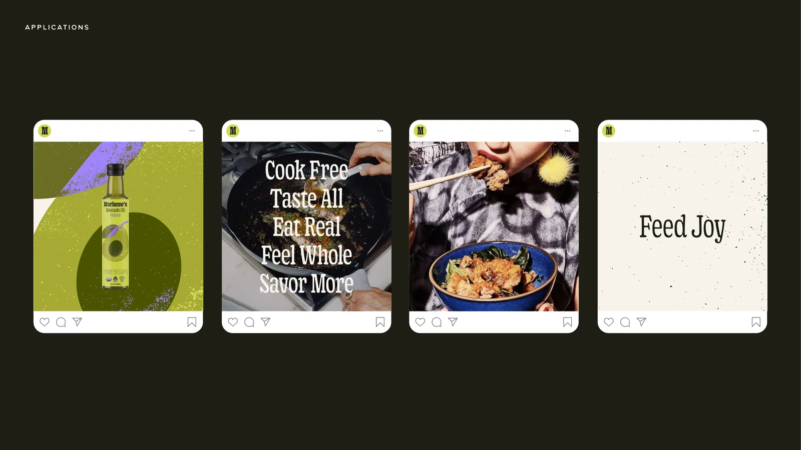
Four Instagram posts: the bottle on green, Cook Free Taste All Eat Real Feel Whole Savor More, a dish being dressed, Feed Joy on cream
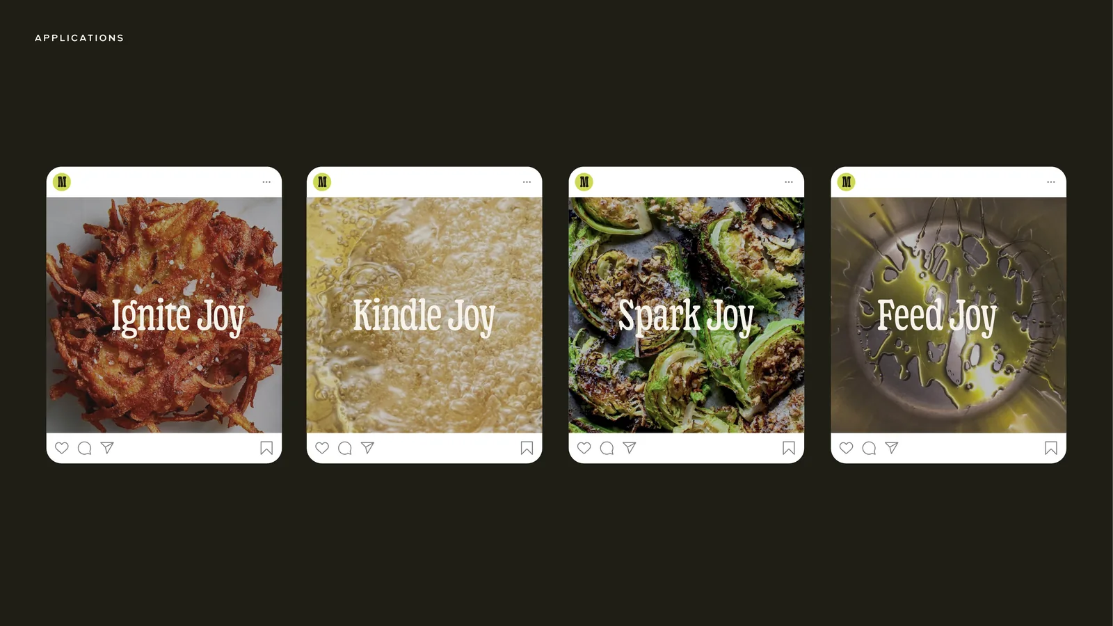
Four Instagram posts over dishes: Ignite Joy, Kindle Joy, Spark Joy, Feed Joy
Position:

Creative director at GURU

Services:

Campaign, packaging, web

Partner:

Marianne’s Harvest

Status:

Launched, 2025